 Welcome to all my visitors from the Sew Mama Sew Giveaway Link-up! If you love color, I’d love for you to follow me on your social media of choice:


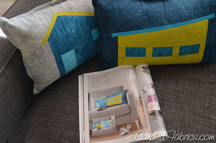
My latest publication is on the news stands right now!
I’ve got an extra copy of the latest issue of Modern Patchwork because my Mid Century Modern House Pillows were published there:
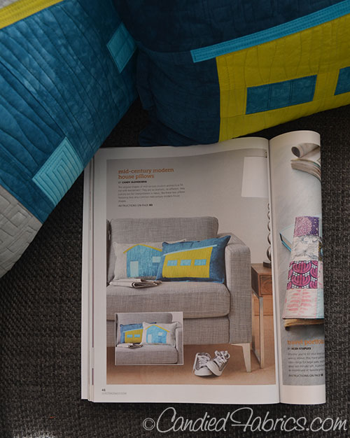
There are patterns for both houses as well as instructions on how to piece them improvisationally, I really love these pillows!
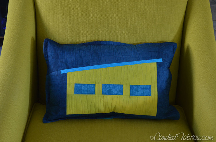
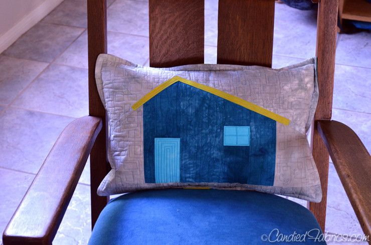
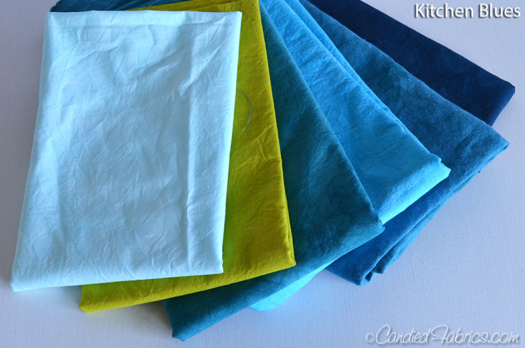
I thought I would give away that extra copy of the magazine PLUS! Enough hand dyed fabric to make the pair of pillows as well! (the zippers, batting and pillow form are not included). You could choose the palette I used to make the pillows in the magazine (“Kitchen Blues” plus a grey):
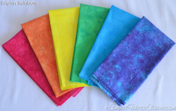
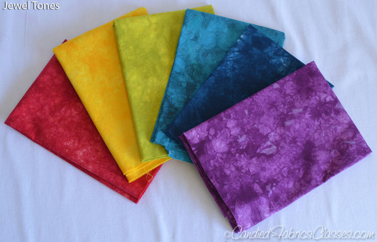
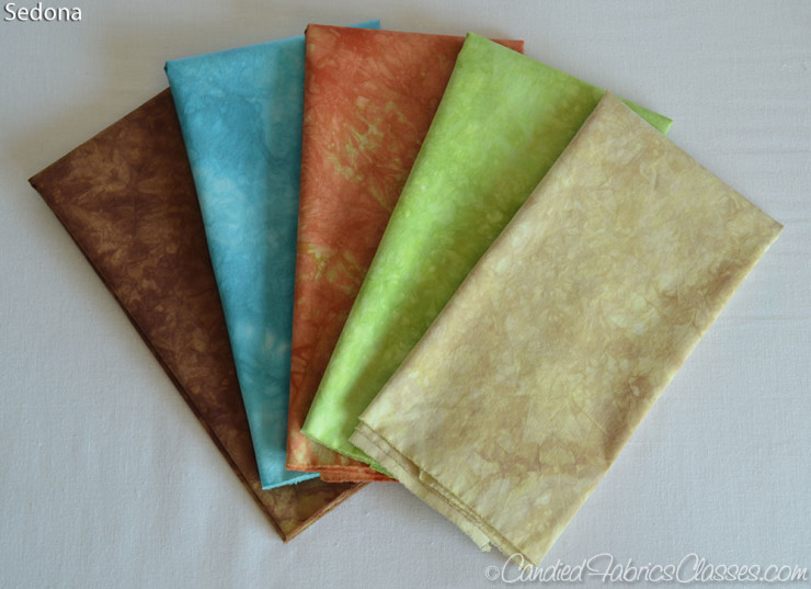
OR, one of these other color palettes:

How can you enter?
Just leave a comment below as to which color palette you’d like, and which 2 colors you would choose for the main/background colors. (Comment moderation is on, so don’t worry if your comment doesn’t show up right away, I’ve got to approve it first!) I will ship internationally.
When does it end?
Sew Mama Sew has put together a huge list of blogs hosting giveaways this week, if you’ve got some time, head on over and enter some more! They all end this Sunday, May 10, at 5 pm Pacific, so you’ve got a few days to tour around and enter a bunch!
I’ll choose a winner Sunday night and announce them here on the blog on Monday as well as emailing them. Good Luck!!!
Winner chosen and announced here, thanks all!
183 Responses
LOVE IT! So fresh and modern.
I love the original color palette with the natural colored background!
I would choose the jewel tones colour pack and would use the purple and dark blue as backgrounds. These cushions are beautiful and the colours of all the packs are lovely I would like them all.
love the kitchen blues. I would use one of the blues in the background.
Id go for the jewel tones and I like your house with the grey background so I might just copy that!
Thank you for a great giveaway. I would choose Sedona and use the 2 colours on the left of the bundle as our colour scheme is duck egg blue with cream and chocolate. x
I love the kitchen blues… I would probably use an essex yarn dyed linen in black for the background and then one main in the green and one main in the light blue
I love Jewel palette and I think I’d make it on black or grey backgroung.
I would pick the jewel tones. Purple and dark blue would go so well in my bedroom
Blues and greens, always. I like the dark background, and I’d make the house light blue. Green for trim. thanks!
I like the range and depth of colour in the jewel toned set best. After considerable thought (!), I think they would work well on a cherry red background, with white eaves. I love the design, thanks for the giveaway!
I would choose the kitchen blues and use the navy and gray.
Jewel tones all the way!!! I’d pick purple and dark blue for the background colors.
I like the autumn splender and the mustardy and green as background
I like your original color way! I’d probably pick gray and blue for the backgrounds, too. That would match my living room. 🙂
All the color palettes are lovely, but I really like the Sedona. I think I’d use either the blue or the cream as the background color.
You’re making this so hard! LOL!
I love Sedona, and I’d pick the green and brown
I just love your pillows. The Kitchen Blue using either black or brown for the background. Thank you for being a part of the SMS Giveaway Day and giving us this chance to win a copy of the magazine and the pillow fabric. Those pillows will make a nice decorative touch to a couch or even a bedroom.
Sandi Timmons
sandit1@sbcglobal.net
I like Brights Rainbow, and I’d use light & medium gray as background colors. Thanks for the chance to win! mto2golsen (at) gmail (dot) com
I really like the jewel tones and would probably use blue background for one and, as you did, add gray for the other. Your fabrics are lovely.
Jewel tones! I would use the lime and dark blue for backgrounds. Love the images on the pillows because I am in a mid century home.
Kitchen Blues, and would do the teal and lime green. I like the colors you did and not sure what the names of them are so go with that. =)
thanks!
Autumn splendor for me, love lime and dark blue for background too.
Kitchen blues in your original colorway-can’t improve on your choices-just lovely pillows!
I like the brights rainbow with pale blue and white.
Sedona the tan and blue for backgrounds
I would choose Sedona (that matches my living room awesomely), with the orange or brown as the background)!
I love the Kitchen Blues and probably use the dark blue and medium blue as the background.
I would choose the jewel tones. I would use the yellow and the blue for the background colors.
I think I’d use the Jewel tones palette. Red bkgd, dark blue house for one, blue bkgd with yellow house for the other.
I woudl pick autumn splendor and the blues as background … maybe even split the background and use the green as “gras” …
I like Autumn Splendor and I ‘d use the brown and gold as background.
I follow through BlogLovin. I adore the Sedona colors. The rich brown and copper would be gorgeous together for a background. I also love the green and the blue as an accent. Thanks for a great giveaway. Fingers Crossed.
~Crystal
A Day In My Life, Crochet & Reviews
http://krystlewv.blogspot.com
I’d go with the rainbow brights and use a clear baby blue for the sky. Adorable pillows. Really adorable.
Autumn Splendor is my favourite, especially red and yellow – first two on the left. Beautiful!
Love the jewel tones. I would choose blue and the green as backgrounds. Thanks for the giveaway.
Congrats on being published again!
I love the Sedona palette and a grey background.
I love your original color pallette. The chartreuse color is so amazing. For backgrounds, I’d either pick a tan/brown or a red, because thosse pillows would be on my couch, and my decorating scheme is primary colors and brown neutrals.
I love blue so I’d choose the blues and use the same colour scheme you did
I would choose to make it the same as you did with the kitchen blues and the gray background. Thanks for the chance to win–looks like a great pattern!
I love the kitchen blues, with grey!
The jewel tones are gorgeous! I’d use blue for the background, and have a little yellow house with a red roof 🙂
Jewel tones, Purple house, yellow background.
Thanks for the giveaway – your cushions are great! I’d choose the brights rainbow and I’d use the bright pink and turquoise for the main colours – my favourite combination 🙂 x
I love the kitchen blues group. The grey pillow with the dark blue house is a combination I especially like.
I like the kitchen blues group and love gray or white as the background. Thanks for the chance to win!
I love these pillows! They are so adorable! If I won I would definitely have to go with the rainbow palette the first one without the purple. As for the background, I myself would probably go for Essex Yarn Died Linen in black, just because I love the way these colors would pop off the darkness and the texture would be amazing!!!!!
I would definitely pick the rainbow. I love happy bright colors! I would use a white background or maybe a gray.
I like Sedona, I would use a light cream or off white background.
Kitchen blues! The green for background, a darker blue for the house.
I’d pick the jewel tones bundle and black and white for the backgrounds.
I love the Jewel Tones and would use the dark blue and purple!
i like the jewel tones. Black and white would be good backgrounds
I love the kitchen blues! I would use the dark blue as the background.
I want . . . no, please make it . . . oh, gosh, I’m having a hard time choosing — all of your fabrics are so luscious. I’d probably choose the colors you’ve used, substituting a light tan or cream for the grey. Possibly. I can’t tell what looks good without seeing them in the “real.” I’d probably let you choose. I kind of like the Autumn, but I like the pop of the yellow or lime (see, can’t tell what color it really is) in your originals. Now, I’m gonna settle on SURPRISE ME with something you like that you might have chosen as an alternate colorway.
I really love the Autumn Splendor palate and would probably use the two blues/ aquas as the background/main color. Thanks for a great giveaway! Love the patterns!
Sedona and I would use the tan as background. It’s funny, I was always a blue/purple/rose kind of girl but in my older age have really turned to the 1970’s appliance color palette! lol Must be hormones or lack thereof! Thanks for the chance to enter your giveaway!
I love the blues and would use the medium blue in the background.
My favorite are the jewel tones. I would pick blue and purple as background and main color. Thanks for the chance!!
I like the “Kitchen Blues” plus a grey background. It was difficult to choose a favorite; all are lovely!
I like the blues you used… I’d use the lightest blue as the background & darkest blue for the house.
Ooh, how pretty! I would go for the jewel tones and use the 2 blues for the background. Thanks for the giveaway!
love the kitchen blues. I’d go with a bright green house!
Jewel Tones – Purple and Blue. Love the fabric and the pillow.
I love the jewel tones fabrics – think I’d love a purple house with a yellow background!
either of the brights or kitchen blues set of fabrics – both are great! as for backing, it’d probably be fun to use a green or yellow!
I love the Kitchen Blues fabrics. The original pillows are great.
Jewel tones – with yellow for main and dark blue for background.
I really think your colour choices are perfect – I’d have to do the kitchen blue!
I love blue palette–I think I’d make the houses yellow or grey and use blue for the background!
Love the kitchen blues colorway! I might add a bit of dark grey.
I like the Brights Rainbow. The background should be blue, and the house yellow. Beautiful spring colors!
I love the brights, especially the green, blue, and orange.
I would like to win the brights rainbow with a gray background. I have the perfect quilt in mind!
Thanks so much for hosting!
The jewel tones are amazing
I like the Sedona fabric bundle.
Thanks.
What fun pillows! Loving either the autumn splendor or sedona,with aqua background. Thank you for the lovely giveaway!
I love the Sedona palette. I would use the cream and the brown as the backgrounds.
Sedona with the dark for the house and the beige as background. And the terracotta for the roof!
Definetly the Kitchen Blues with the grey as a background. Have a great day!
Oooh love your pillows! I don’t have that issue yet, definitely need to get my hands on it! I love the kitchen blues colorway!
I would stick with the Kitchen Blues (blue is my favorite color!). I might use white and black for the backgrounds to make the brilliant blues pop! Thanks for sharing with us!
Congrats on the publication, these pillows look so good. The kitchen blues is a great palette.
Your pillows are fantastic -I have a passion for houses – I choose Autumn Splendour the red and the gold colours would be beautiful in my room.
Pauline
Perry94022 at hotmail dot com
Jewel tones, green background, turquoise house.
The Brights Rainbow palette is my choice along with gray and navy blue for the backgrounds — yummy pretty!
I vote for brights rainbow. It was so hard to choose. I’d pair them with 2 colours of grey , one light and one medium. Would have to see the real fabrics to select the shades!
I would love to use the Jewel tones and would try an off white as a background or a pale lime green. Really like your cushion designs.
Hi – I love Autumn Slender and I think I’d choose the purple & the light blue. Thank you
I love the jewel tones and I would use an olive green as the background or maybe a deep, deep plum.
Your original palette is exactly what I’d pick — it looks like they were made to look particularly great in my living room!
I love the bright rainbow! It would look perfect with 2 different greys for background. Thanks!
I love the brights rainbows! Thanks so much for this great giveaway!
Sedona. I would use the fabric on the right for the background.
I like the Brights Rainbow. Red for the background.
Brights Rainbow with the dark blue for the background.
Love the jewel tones! Great pillow and love the magazine!!!
I would choose Sedona. Love all the hand dyed colors though. The pillows are great. Thanks for the giveaway chance!
I like the kitchen blues – the green and the dark blue are good together.
I would choose the jewel tones with blue and green for the main colors
Turquoise, orange, and tan for a Southwestern look.
I think the Sedona would be beautiful. I would use the brown and tan In the background.
I love the jewel tones and would use the blue and turquoise for the background. Thanks for the great giveaway!
Sedona with turquoise and orange for sure!
I love Kitchen blues and anything orange.
I love all the colors, but I’d go with Jewel Tones. Would use red as main color and green as background.
I would chose the Kitchen blues, and exactly the same background colours as you used. Thank you for the chance to win x
I’d choose Sedona, and pair it with a forest green or navy, and cream or gold.
So fun! I would choose bright rainbow with the blues for background.
Ooh, I love Kitchen Blues! It would look perfect in my baby boy’s nursery :). I’d do dark gray for one background and a blue for the other.
I love, love, love blue so I love your choices. I might choose Sedona since I have aqua in my living room not blue blue. What a great giveaway. Many thanks for an opportunity to win.
Love the hand dyed fabrics,
should i win, i would choose the “jewel tones” and grey would be my background of choice.
thanks sharing for your creations.
xo
eva
Ooh I really love Sedona, and would love to use the lime green, and tan for background colors.
Thank you for the chance to win!
I love the Autumn Splendor colection of fabrics. They are amazing colors.
Kitchen blues all the way. I’d be tempted to use the acidy green for the house and the blues for window and background
I would choose the Kitchen Blues with a grey background!
My choice is Kitchen Blues–love the pillow. Thanks for the giveaway.
I like the Jewel Tones. I’d use the yellow & green as the backgrounds.
Kitchen Blues! I love that lime color with the blues.
I love them all but the jewel really got my eye….ty for the ideas very very cool….
I would choose the Autumn Splendor to go on our brown couch. I’d choose the red and the brown for backgrounds. This would be a wonderful treat!
I would choose the Sedona collection using the brown and cream for the main/background colours. Thanks for participating in the SMS giveaway day. Your giveaway is awesome.
Love the Bright Rainbow group! Yellow as the house color & bright blue as the background…Congrats on being published & thank you for your generous drawing!
Kitchen blues for me – with the green as one of the two colours. So pretty!
I love Kitchen Blues. I’d leave the other choices down to you :0)
I really like the kitchen blues and would use a robin blue as background. Thanks.
I love the colors you used!
I love the Kitchen Blues fabric selection. I’d use the 2 darker blues as the background fabric and build from there.
I’d choose Autumn Splendor, and the red and lighter blue as backgrounds.
I love the brights rainbow with the purple and the blue as the background. Congratulations on your publication and thanks for the opportunity to win.
I like the Brights Rainbow and I’d use the darker blue as the background and the red for the house. 🙂
I like the brights rainbow with a yellow background — sunshiny!
I like the pillows in the original colors! Thanks!
I also love the rainbow, but not sure quite how I would plan it out yet. Still thinking about it.
All the colorways are gorgeous, but I think the Kitchen blues would go best with my decor! Whoops forgot to add which colors I’d use for the backgrounds. I like the Kitchen Blues just the way you did them adding a grey & using the dark blue for the other.
Lovely giveaway so generous of you.Congratulations,you must feel so proud.Autumn splendor is my fav. Blue and orange would be my choises.Have a lovely weekend.
Kitchen blues in your original colourway please – I love your combinations as they are in my favourite colours.
I would take brights with a Robins egg blue and white for background. I really like the Jewel colors too.
I’m with you on the kitchen blues.
Fabulous pillows and fabrics! thank you for the giveaway. I like Sedona – blue and cream for the background colors! thanks again!
Sedona……….oh so perfectly reminiscent of AZ.
Pairing it w/Kona turquoise and sand would make my jaw drop.
THank you so much for sharing .
Oh love them all! I’d have to pick autumn or Sedona. With maybe a taupe background
Hand dyes are so interesting and varied, I particularly like the Autumn Splendor and would use the goldie one as the background.
I like Brights Rainbow best, I’d use them for the houses and a medium gray solid as background fabric. Thanks for the chance!
I love Bright Rainbow fabric collection. I would use Kitchen blue’s blue as my background.
I love the Jewel Tones colors, and I would choose the purple for the background and the green and yellow for the house. Thanks for your beautiful blog, for sharing this project, and for your great giveaway!
love the jewel tones!
emmevon(at)gmail(dot)com
My favourite are the Kitchen Blues as well. Super pretty. I think i would choose the light print on the left and the light blue as the background fabrics 🙂
Many thanks for the chance to win!
I love Sedona and would use green and beige colors.
Thanks for a chance to win!
julia(dot)glotova(at)gmail(dot)com
oooh! it’s a tie between kitchen blues and autumn splendor, but I’ll go with kitchen blues. I’d probably use the dark blue for background and medium blue for house and lightest/brightest for the details.
I love the Jewel Tones and would choose the gold and dark blue.
I love the jewel tones color selection. I would choose to use purple and teal as the main/background colors
I am under the influence of my landscape in Santa Fe … so I’d choose Sedona and I’d make mid-century adobe houses, using the turquoise for the background and the adobe-like tan for the main color.
I’d go for the Kitchen Blues palate. I think I would go for a dark and a medium background.
I really like Sedona and Autumn Splendor. I would use the brown or the blue for the background. Thanks for the great giveaway.
I like the bright rainbow pack the best and would probably do the backgrounds in blue. Or if I could pick a different fabric, maybe use gray.
I’d love the Autumn splendor with the golden yellow and darker blue for the background colors.
I love sedona! I would probably use just a neutral background!
I like the Brirhts rainbow with blue and grey, thanks for the giveaway!
I would like to win the Sedona fabric I will let you choose what to send if I win. Your pillows are cute. Thank you for a chance to win.
I would like the kitchen blues. So cute! thank you, peterstankovich@comcast.net
I think I’d go for Autumn Splendour, but I love them all. I’d use white and grey for background. thanks for the chance!
Your colours are so beautiful. I would choose the jewel tones with a dark blue or an aqua background. Thanks for the chance to win.
Brights Rainbow or Jewel tones… Id use…. red and blue maybe?
I choose the jewel tones, beautiful! Purple for the main color.
I would choose Autumn Splendor, and I would pick a dark raspberry and dusty green for the background colors.
I love kitchen blues. I would use the light blue for background.
I love the Jewel Tones. I would choose the darker blue and the green for the background. powersjlc (at) gmail (dot) com . Thank you for the chance.
Those are beautiful. I love Autumn but would probably choose Sedona to match my house colors better! Maybe orange house blue background (sky)?
I love the Sedona colours and I would use the brown or cream as the background 🙂
Sedona matches my house colors best, and I would use a linen or low volume for the background.
I love the brights rainbow! And I would put them on either a navy or charcoal gray background.
Beautiful fabrics! I love the kitchen blues w/gray or the sedona but not sure about the best background color for those. Thanks for the giveaway!
I’d choose Sedona and use the blue and cream as background colours.
So gorgeous! Can I just have them all please!! Autumn splendor would be my favourite. I’d probably use the green colour as the backround and yellow as the main colour. Your pillows are to die for!
Love Autumn Splendor and I’d use the two blues as background.
Jewel tones please, with the purple and dark blue as the main colours
So pretty! I love the brights rainbow and I would choose the pink and orange for the house and some kind of neutral for the background. Thanks for the chance to win!
These are so cute! I’d pick either Kitchen Blues or Jewel Tones.
Super cute!
Jewel tones for sure! A blue background and a purple house would be my choice.
I like Autumn Splendor and would try Red and Grey. crystalbluern at onlineok dot com
Yikes, not sure what I’d pick!