So, now I’ve shown you the plans, I can tell you a little about the COLOR stress I’ve had over this kitchen! My Pinterest kitchen board is kind of like a stream of consciousness peek into what I was considering for the kitchen in a kind of temporal fashion!
I started with these things that I can’t change and my basic thoughts on what I want the kitchen to look and feel like:
- The grey/blue/beige floor tile runs through the entire first floor, it is here to stay. In the living room, dining room and half bath, we’ve painted the walls a sandy color that brings out the earthy tones in the tile and got rid of the cold, blue feeling that was in the house when we bought it. What I wanted to do in the kitchen/family room is to make a transition to a cooler grey color, without it looking battleship grey or trending back toward the cold blue we worked so hard to get rid of.
- Cabinets: Ikea for cost, white because I love the look.
- Coutertops: Maple butcher block, from lumber liquidators. If I had an umlimited budget, I’d go for soapstone, but I don’t, and I love the look of maple with white, so there you go!
- Backsplash: White subway tile. Simple, classic, won’t get in the way of any color I want to bring into the kitchen with accessories, and…dirt cheap too!
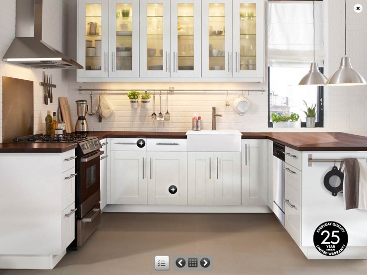
After studying all the different white cabinets fronts Ikea offered, the only one we really like was one called “Adel”, which is a simple shaker front. Although the counters are darker than maple, everything else in this Ikea catalog picture is pretty much what I wanted to do in our kitchen (love those handles too!):
So I started working on kitchen plans using their software. When doing that, I noticed that they kept calling the Adel cabinet fronts “off-white”, although they look pretty darn white in that picture up above, don’t they? At my next trip to Ikea I looked at all their whites closely and indeed saw that the Adel white is different from their other white cabinets. We bought an Adel door so I could bring it home and really look at it. And then I started carrying it around to Lowe’s and Home Depot to look at their white subway tile. Lo and behold, the white of the subway tile in both stores was not a close match to the door! So, I ordered other brands/color of white subway tiles from Home Depot and studied the samples of all the different whites at home in different parts of the kitchen/family room.
I also bought a door from another Ikea cabinet style that was a true white, and it did match one of the subway tiles, but, I don’t like the feel of these, they’re a bit too traditional:

(But oooh, that white subway tile with grey grout – LOVE!)
Anyway, I confirmed that the Shaker style Adel cabinets were the only ones I wanted. We went to a couple of actual tile stores as well and could not find a white matching subway tile there either. Because Ikea names their products with such distinctive names it’s easy to find a lot of pictures of what you want to see. I saw some examples of kitchens with Adel cabinets that had white subway tile that looked like a pretty darn good match. BUT, I also saw some pictures of Adel kitchens with white subway tile that REALLY didn’t match – and set up a red flag for me. I reallllly did NOT want my kitchen to look like one of those! (I’d rather not post a picture of someone’s kitchen when I’m talking about how their tile doesn’t match).
Sigh, this part of the project was supposed to be the AFFORDABLE part of this project: White Subway tile from Lowe’s and Home Depot is $1.13/square foot and we need 55 square feet, so it was going to be way under $100…sad trombone music.
We started to look at other options and confirmed that:
- Tile gets expensive FAST!
- Tiny mosaic tiles and “beige tumbled marble” looking tiles are plentiful at Home Depot and Lowe’s. The tile showrooms had lots more options, and the current fad seems to be long, skinny mixes.
I really, really wanted to stay with a subway shape, because that shape is classic. Lots of the tile I saw at the big box stores already screamed “dated” to me, and I’m sure those long, skinny mix mosaics that look cool today will scream “dated” in 10 years too!
After a depressing visit to a big tile store, we returned to Lowe’s and really looked at all the options…and found one we liked! And it’s on the affordable side at $6/st ft! (Hah! I say affordable after seeing so many tiles at $10, $20, $30 and up/sq ft!!!
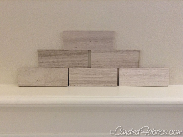
Here it is, on our beech wood topped island (a pretty close match to maple) alongside the Adel door:
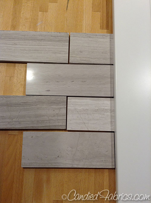
It’s limestone! I love the natural variation in this stone, tiles with varied tones instead of a big expanse of a single color often caused me to pause and go “oooh” while surfing the design possibities online.
With the major components picked out, I then had to find the perfect grey paint. (Some of you may be wondering why I’m going so neutral! That’s because I want the option of changing colors in the kitchen down the line. Right now, the plan is to paint the island CHARTREUSE! But I may get tired of chartreuse in a couple of years, and it’s a lot cheaper and easier to paint the island than the whole kitchen! (Or re-tile…I was mighty tempted by some fun color tiles, but ultimately I chose the limestone because I love it AND it’s neutral!!!)
The search for a warm, mushroomy grey was a long one. And I had some wrong turns because I didn’t label the swatches I painted on the wall. But long story short, I found what I thought was the perfect tone of warm grey, had some trim paint color matched to the Adel cabinet and started in on the family room. Of course, this was 5 days before we had a big reception to give at the house, with Andrew being super busy at work for a big International Double Reed Society conference. Not the best timing, but I really wanted to get this half of the room spruced up before we get underway in the kitchen. I know we’ll be pooped when we finish the kitchen, this way it’ll be the end, rather than “Oh no, now we have to paint the other half of the room!”
First step, relocate the flat screen to the boys playroom. Liam practices more now, and when he practices, you really can’t do much else in the downstairs. So moving the TV upstairs, along with the Wii, allows Logan to play video games when he’s done with homework and chores. I’m still not totally sure about this step, because Andrew does like to watch sports and he’s the one in this room cooking. We’ll give it a try and see what we think, and in the meantime Logan’s happy to have a quiet place to play video games.
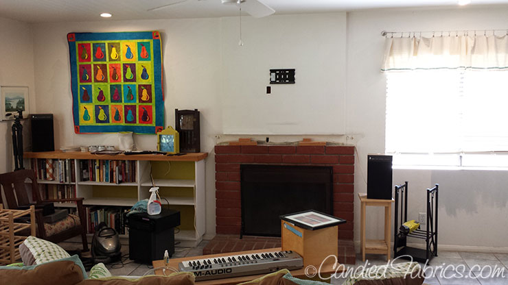
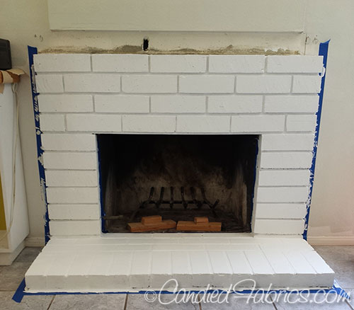
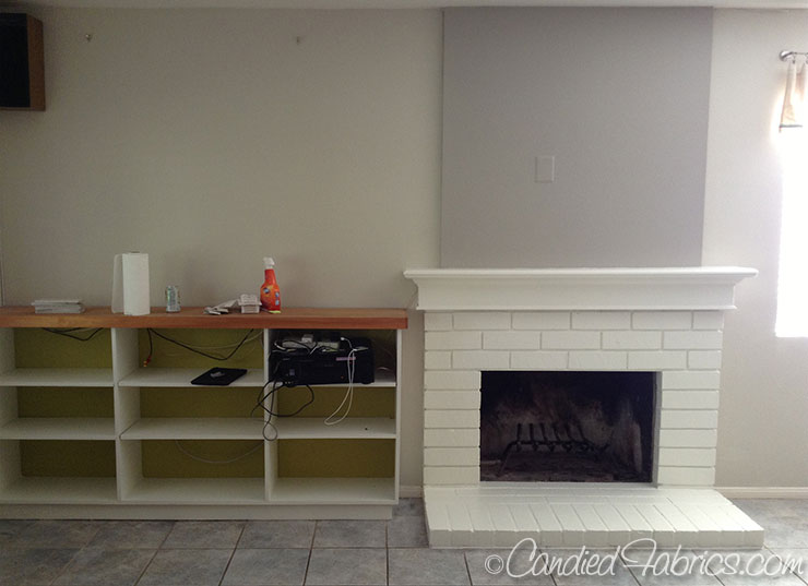
Say goodbye to the red brick!
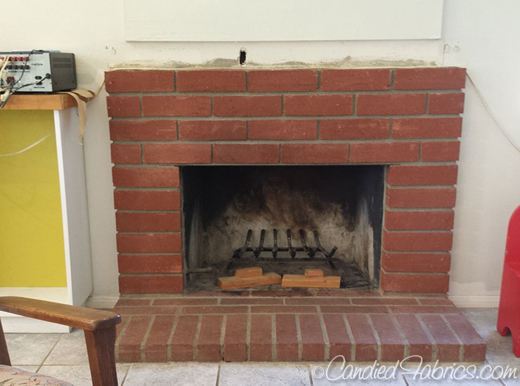
It is scary to do this, because there’s no going back, but John & Sherry from Young House Love inspired me to give it a try!
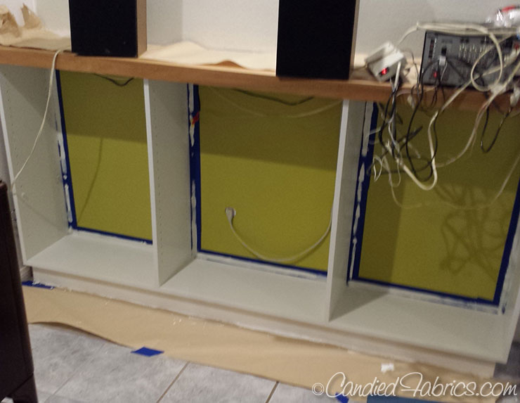
I also had to re-paint the bookcase, although it was white before (with a chartreuse back, I left that part alone!), it wasn’t the Adel white. Plus it was really dirty!
Here’s a cell phone picture after I got the walls and fireplace painted.
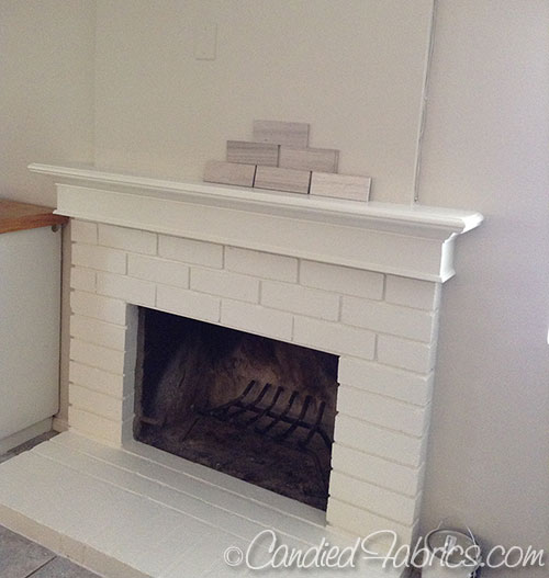
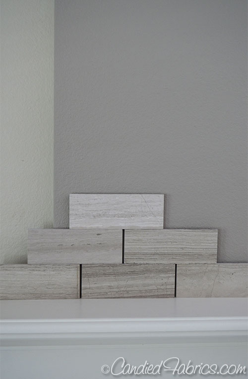
I’m really happy with the way the tones of grey in the limestone match my mushroom grey!
However, in lots of the lighting conditions it looked more beige than grey. I really didn’t want to go too much darker, but thought if I painted just the wall the sticks out just a bit above the fireplace a darker shade it would bring out the grey feel. So back to the paint store I go!
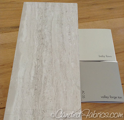
Folks on Instagram & Facebook agree the names for my 2 paint colors make no sense! 🙂
Here’s a cell phone pic I shot as soon as the darker paint dried:
And a couple of close up shots with the kitchen backsplash tile for reference:

I’m quite happy with where I ended up! And this half of the room got painted and put back together in time for the big reception we had to give!
I’ve got more pix of the results, but this post is long enough! I’ll share them soon…
2 Responses
I am with you. The darker grey is the best…and with the tiling! Gorgeousness in it’s neutrality! This will allow you to vary the fabrications with lots of the color you love! Great choices…
I love the limestone subway tiles … so nice! Will you be making a special quilt for the spot above the fireplace? We also painted our fireplace a nice shade of white when we first moved into our house. It’s amazing how it makes the entire room sparkle. Ah, sadly I know what you mean about those skinny tile mixes looking dated in a few years. I love them too but I agree that I’d be disliking them down the road. Your subway tiles are a nice traditional look that will last a long time.